HarmonyOS
Here are the five UX design details of HarmonyOS mobile operating system
To date, Huawei HarmonyOS2.0 installation in the Chinese market has been exceeded over 30 million, which is a huge achievement that has been achieved in under a month. To be mentioned, the release is still limited to the Mainland and yet to expand at the global Huawei smartphone users.
The fact that Huawei users are eagerly waiting for their turn to experience HarmonyOS capabilities and the effort of Huawei in delivering the OS can be seen clearly.
The Chief of Huawei Software Engineering UX Design Department- Mao Yumin is very gratified with the performance and efforts that have been made since the launch of the HM OS release. He is also hoping for the user to try new products and software systems of the company.
In this line, he instructed 5 senior UX designers of the Huawei UX Design Department to elaborate the major five highlights of the new software system for a clear understanding of users. These five keys include the following-
- Light physical design
- Card design
- HarmonyOS fonts
- Gravity dynamic effects
- Customized sound effects
The design chief explains that HarmonyOS is based on the theme of one harmonious universe, which unified design language for the entire user interface. Furthermore, this new OS creates a balance between the digital world and the real natural world.
Each designer instructed by Mao Yumin was best in his work at the design department and they explain their part very clearly for further understanding. Let’s discuss the explanations shared by the designers of each topic one by one.
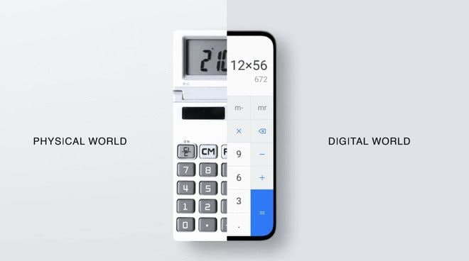
Light physical design: Balance between the digital and physical world
Huawei HarmonyOS adopted a lightweight physical design. The digital features have the feeling of real-world touch. HM OS offers the charted objects in the physical world, such as calculators that can blend with a real-world sense.
It converts the calculator buttons into electronic calculators. The system software has a slightly lifted button, which creates a hollow effect to confirm the feedback after the user pressed the dial.
Similar to this, the HM OS interface provides other physical objects including compasses, temperature measurement, and memo with light-weight effects.
Besides, concerning the problem of large resources utilized by counterfeit objects, Huawei introduced a new coding, or we can say solve the problem on the coding head.
The company uses a visual design tool in building this software interface to bring the modification in the present using the most proper design.
After adjusting the visual tools, the user can directly ship the XML contour file parameterized, and then straightly go to the App design. Users are able to access the XML file without coding and restore the design effect. This is how the method solved the problem of resource occupation in the system.
Card design: Multidevice Communication
HarmonyOS 2.0 allows the users to use the universal card by moving the application upwards on the screen in a curved manner. It’s actually pretty simple that HarmonyOS identify sliding in any direction- upwards, downwards, verticle, and horizontal.
HarmonyOS designers spend a lot of time and made great efforts to learn human factors and investigate the trajectory of a sliding gesture. The team concluded the three most critical indicators that are responsible for the operation.
- Sliding Angle
- Sliding Speed (Fast/Slow)
- Sliding Distance
Moving further, the heat map shows that the color depth is where the sliding is more difficult while the different pointers have reached similar conclusions.
Adding to this, some pieces have easy sliding whereas some are tricky. Finally, the designing team has mixed the right and left-hand operations to find the light zone and heavy zone.
These two areas with the combination of three-pointers had some unique perspectives to define the easy trigger. For example, a small angle can reach the sliding index at easy places with the same speed. You can say that the easy area slides faster, and the difficult area slides slower.
On the other hand, the speed threshold will be lowered, which will make it easier to trigger in the difficult area. This same applies to distances. The easy areas are comparatively long, while the difficult ones are not.
Huawei’s designing team worked hard to solve all these problems and formed a special design that fits all kinds of scenarios.
However, the team didn’t forget the relative motion effects and done tons of research on motion duration and frame spacing that can deliver a smooth effect. This is also divided into three zones, which includes the following:
- The Comfort Zone (with maximum frame spacing)
- The Safety Zone (with maximum least spacing)
- The Pass Zone (with maximum moderate spacing)
HarmonyOS fonts: HarmonyOS Sans to support over 105 languages
As the designer explains, Huawei thinks about bringing a new font with HarmonyOS for a long time, because it needs a long time, effort, and investment to create a brand new font style package. Although the company can choose other official designs, the designers prefer to bring a new fonts system.
HarmonyOS comes with a brand new default font – HarmonyOS Sans, which is designed for various Huawei devices.
This new font family has a variety of default font considerations, including the dimensions of different devices, usage scenarios, and different users’ requirements for font size and weight due to differences in line-of-sight and angle-of-view.
The company specifically works in two aspects- structural balance and writing stroke. It’s also believed that the balance between inside & outside space, blank space, yin & yang, and randomness of the language curves must be elegant and expressive.
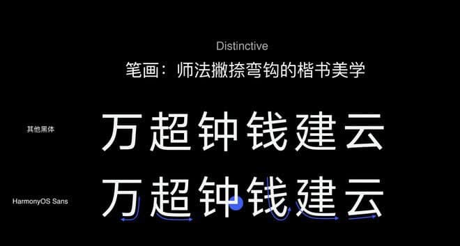
“We kept the short strokes simple, and long strokes, such as left-falling, right-falling, hook, and turning strokes, are blended with the calligraphy aesthetics for a whole new typeface experience. The hooks are beautifully renovated, and these are extracted from the basic strokes for alteration.” Said a designer.
The fonts have every kind of arrangement from its text weight to text style, every feature can adjust according to the screen size and screen type. If you compare typefaces such as boldface or regular face of HarmonyOS fonts, you’ll find it more humanistic than others.
Moving ahead, the grayscale eliminates the need for different viewing angles, with HarmonyOS Sans there is no more need to squint your eyes to get a more clear view. Adding to this, Huawei has also solved the problem of mouthparts of the letters.
To be more descriptive, there are two kinds of mouthparts or opening centers including Song Ti and Kai Ti in the Chinese script. The first one is for the bottom and the second one is for the top. Among them, the bottom mouth is comprehensively hard and can create a problem to develop the font.
However, Huawei designers consider this bottom mouth milder as it’ll increase the complexity of the inner white once successfully installed. Thus we didn’t make any customization in the bottom mouth while the non-bottom mouth has been slightly modified.
The HarmonyOS Sans carries a large writing system, where we can see the collaboration between the text, symbols, and icons that will directly affect the user’s involvement. It supports about 105 languages including simple & traditional Chinese, Latin, etc as well as westerns languages.
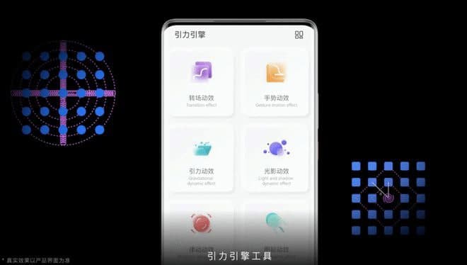
Gravity dynamic effects: Dual gravity motion effect
The HarmonyOS design adopts a dual gravity motion effect, which is unique at one side and smoother at the other side. The design provides a seamless flowing art motion effect, which spent a lot of time on operations such as clicking, sliding, and dragging for different Huawei devices.
The motion effects revolve around the gravitation in the universe, based on the physical laws from cosmic gravity creating some sense of the rhythm of movements.
Talking about implementation, when you load dynamic effects, the interface first loads the universe shape effect then emmit the star layout and moderately added some effects on it.
Furthermore, to add the extra effects such as some cameras to make the planet’s orbit more projective, and the effect of sweeping the tail, it improves the rotating speed of some flexibility effects.
Huawei brings the ecliptic angle, using the earth as a mobile reference, and brings the symmetrical and balanced structure to make the animation more real.
To make this dynamic animation more graceful, the company added the floating up and down features. Moving ahead, you’ll see two models – the motion model and the gravitational model for coordination effects.
The motion model targets the speed and track of each device during the revolution, keeps the orbit at the same speed. Meanwhile, the gravitational model is more critical focused on pulling a device by hand, and then connect it to the main device.
Additionally, the company combines the design of dynamic effects with gestures to keep the strengthening gravity in the limelight. While a gesture is dragging a ball into gravity, a small and big ball starts to connect with each other.
If we keep continuing both balls will start to attract each other, which indicates a solid connection. The animations downloading delivers the effect of a solar and lunar eclipse can be considered as an example.
Customized sound effects: rising sun & universal space effect
Customized sound effects, the boot sound in the system interface uses the last two syllables of the four syllables of the Huawei smartphone ringtone. As the system is designed on the theme of a harmonious universe, the HM OS uses digital synthesizers.
The digital synthesizer mimics the rising sun and the universal space effect. The company chooses the rising sun as it reminds of new beginnings, to ascend, which perfectly fits with the concept of a slowly rising circle in the animation.
Huawei created a feeling of “ding” to symbolize the opening of the universe, which has united with all kinds of different particles while the initial explosion effect creates an interface with a mightier touch of universal space.
Speaking of the ringtones, HarmonyOS remains with the four scales melody of Huawei, while giving it a touch of wood music. Furthermore, the foremost harmony is German-made grand piano and the sustaining melody is a marimba made of Honduras wood.
The immersive sound will surely take you to the next level of a melodious experience completed with a touch of single-panel guitar made of Canadian spruce.