
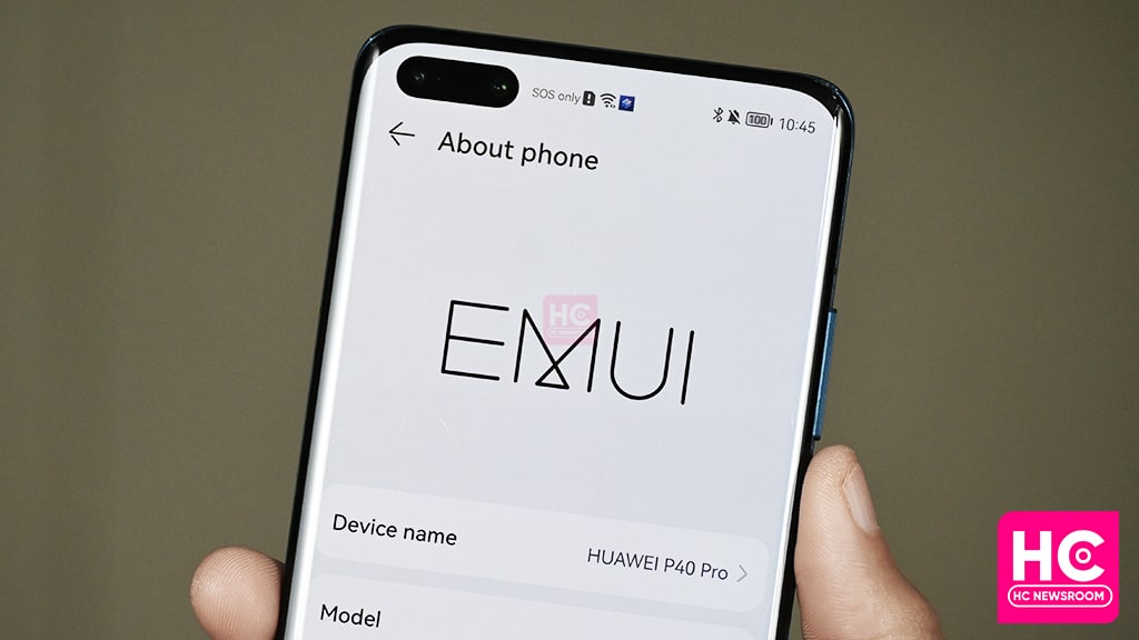
EMUI
Here’s my experience with EMUI 12 before we jump to EMUI 13
EMUI 13 is on the horizon but we can stop at this point to look at EMUI 12 and check how it has evolved in terms of user experience. For this sharing, I’ve selected the top elements of this software and what has changed to provide you comfort while operating.
Let’s begin my experience sharing with EMUI 12:
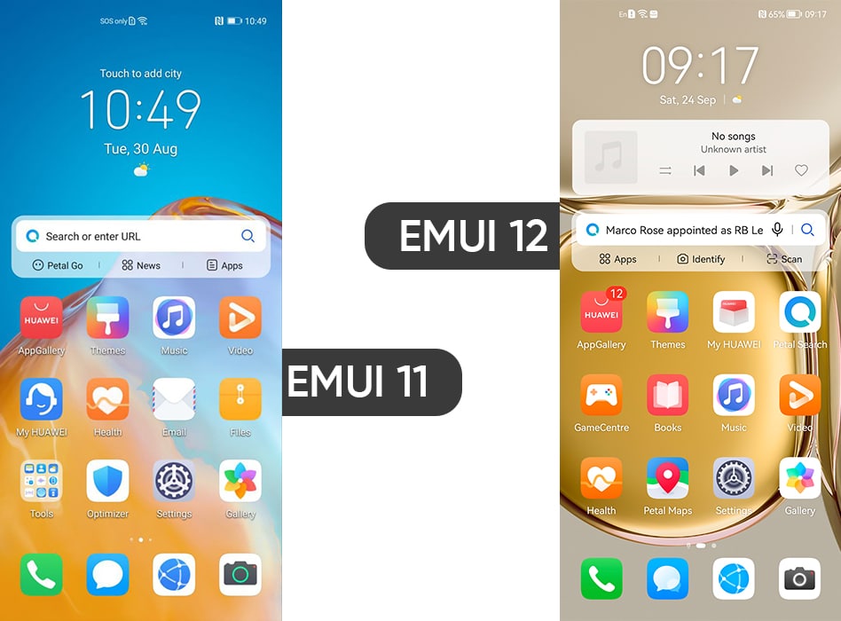
Once you unlock the phone, the home screen brings you a new view. Yeah, there is some furnishing made to app icons. Meanwhile, I’ve missed the app swipe-up gesture on EMUI 12, since it also comes in HarmonyOS 2.
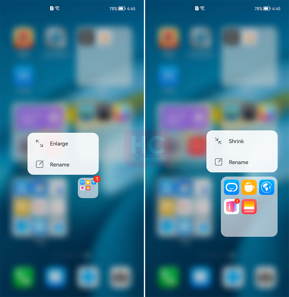
Large Folders:
Large folders is one of the most used and praised features, many users report that this is a feature that we could call “New”. While in my opinion, it’s something that every Android phone maker could copy from Huawei.
You just have to tap and hold and choose “Enlarge” to actually enlarge an app folder. The use of this feature allows you to organize the home screen with an easy-to-access one-tap app launch without opening the app first. Such a feature has not been there in the past version and its introduction saves a huge space on the phone’s home screen.
Animations:
During swipes, switching apps, or opening the taskbar, you will feel the improvements made to fluency. This experience is better than the last EMUI version for sure, yet, I found HarmonyOS 2 more fluid.
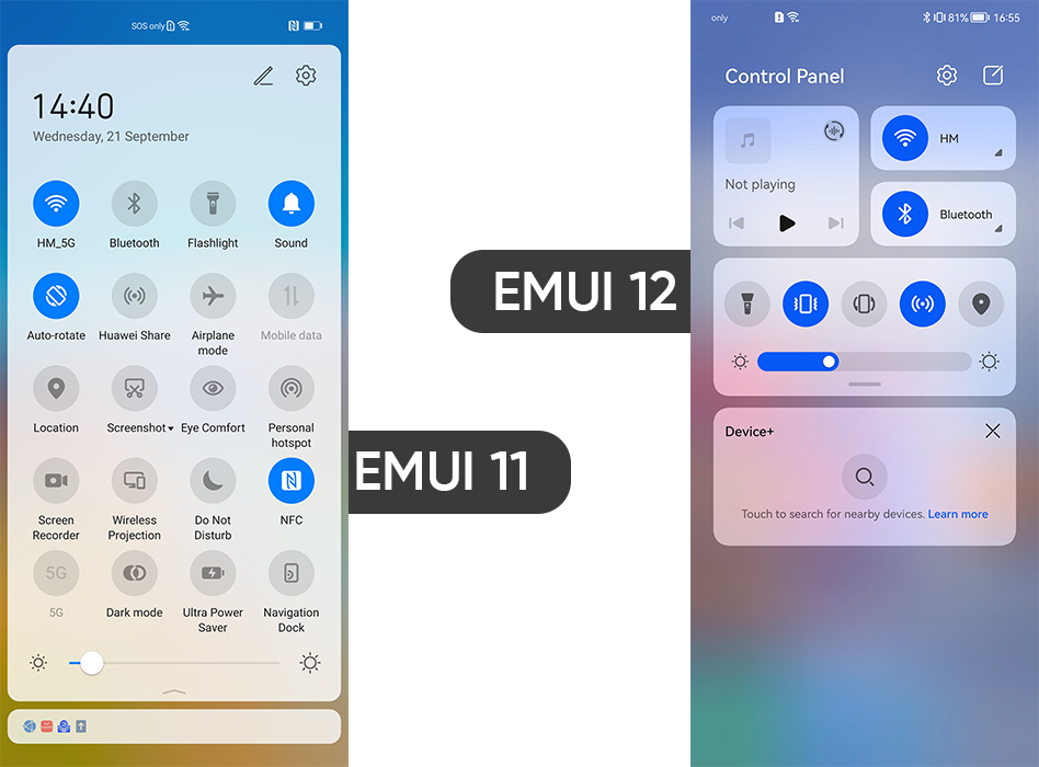
Control panel:
The Control panel is a brand-new feature and it completely revamps the user experience. It has the most commonly used settings, placing media audio, shortcut switches, and paired device controls in your hand. In addition, Huawei added a new layer of improvement with other two widgets of quick services.
Notification panel:
Before EMUI 12, I used to access notifications via the quick settings panel. Now, you can grab all of your notifications in a separate space called, Notification Panel.
You can access that by swiping down the top left corner of the screen. I found this feature useful and a lot better than EMUI 11.
Settings menu:
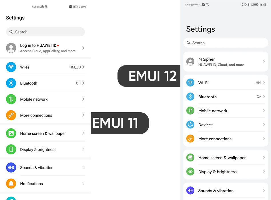
I am impressed with the changes that have been made to the user interface and the overall design of UI/UX. These changes clearly appear on the Settings menu combined with the new font system.
Look at the image below, the left is EMUI 11 and the right one is EMUI 12. Both of these are different and EMUI 12 surely wins our attention in the first place. The view of menu elements is visible and looks better than in the past version.
Honorable mentions:
Aside from the detailed view, there are some honorable mentions of some key functionalities such as multi-screen collaboration, app opening performance, and privacy and security. However, these could have been better but there is no significant changes found.
Verdict:
EMUI 12 is something that is eligible to call a “real change” in the EMUI universe. More than that, it’s what Huawei smartphone users have been looking for for a long time.
So, make sure to learn about these above-mentioned features before we all jump to EMUI 13.


