
Android
Redesigned Google Discover released for Android 12 beta, now it is card and descriptionless
Google is soon going to reveal the next version of the mobile operating system, Android 12. At the moment, developer beta testing is going on, which is available for Google Pixel 3 and above model.
Recently, Google has released the new redesign of Google Discover. Firstly, the visual updated design of feeds was introduced in iOS and now started rolling out for Android 12 beta testers.
According to the information, the stories in discover feeds are no longer available in individual cards. Instead of this, they are directly placed on flat grey and white background in an approach that does remove padding but ends up being quite generic.
Additionally, Google is not really taking advantage of that gained space. As the articles no longer feature the first sentence and don’t have a description. Now, all you get is the cover image, headline, and publication logo.
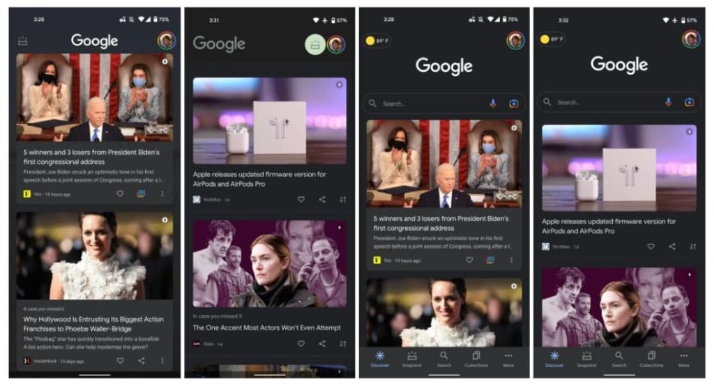
Without descriptions, until you open the article you will not get much information. Moreover, a new icon in the overflow menu in the bottom right corner now has share and heart button.
The new changes have applied to both the Google app and the feed to the left of most Android home screens. This description and cardless design have been available on the iOS Google app for quite some time now.
Earlier this month, the new look of the discover feeds has started, when Google made its logo left-aligned rather than centered. Moreover, the snapshot option is also placed in the bright circle beside your profile avatar.
Note: These changes currently not available on phones running earlier versions of Android.
(Source)
Also, check:
Google Maps and Android Auto receiving new updates, brings new optimizations