Google Play
Google Play Store to get a new logo with low contrast colors
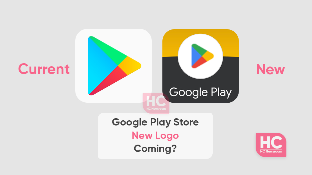
Google is seemingly preparing a new logo for Play Store, the world’s largest smartphone app marketplace. As revealed in the images shared by 9to5Google, Google is keen on using low-contrast colors instead of continuing with the high-contrast and more vivid color combination.
According to the information, the new Google Play Store retains the triangle shape but with slightly increased round edges on all three sides, as compared to the active logo. Moving on, the shapes inside the icon is more justified and has better space management or are nearly equally margined according to the geometry.
(Play Store New logo)
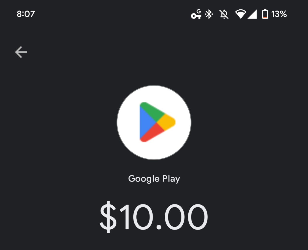
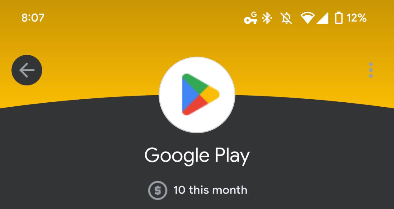
Currently, the icon has been spotted in low resolution on Google Pay and is soon to come on Google wallet, as it will appear on the transaction screen once you grab the successful transaction or add credits to your account.
(Google Play Store Current logo)

It’s also revealed that the new icon remains is not widely rolled out and may only be found on the app itself. Therefore, you’ll continue to see the old one on the Play Store’s main page or in the app itself.
Back in 2016, it was the last time when Google changed the Play Store icon and after six years of the long run, it seems like this major application market is now ready to turn new shades for the future to come.
Still, Google has not made it official, whether this new icon will be the face of the upcoming Play Store version but it’s Google and we will see things happining once they start to appear on the ground.

