Huawei
OpenHarmony 4.0 release version launched with API 10

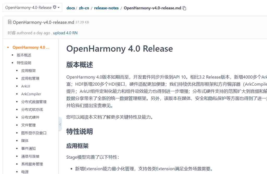
OpenHarmony 4.0 operating system release version launched today as scheduled alongside API 10. Compared to the OpenHarmony 3.2 stable release version, the new OpenHarmonyOS 4.0 comes with 4,000 ArkTS APIs, which enriches application capabilities.
The HDF has added over 200 HDI interfaces allowing more hardware adaption. The developers have also optimized the graphics framework and ArkCompiler to improve user interactions.
ArkUI component customization capabilities and component animation capabilities have also been further enhanced; the scope of distributed hardware support has been expanded to the audio and input fields.
This release version also new unified data management framework for developer data sharing in distributed hardware support. In addition, this version has been further enhanced in terms of media, security, and privacy protection. Developers are welcome to use it and give us valuable feedback.
There are tonnes of changes that are made in the OpenHarmony and a few of them from Animations and UI are mentioned below. You can check all of them in the Gitee release notes here.
Basic components added or enhanced:
- A new UIExtension component is added, which is used to embed and display an application into another application through UIExtensionAblity.
- The drawing component Rect/Circle/Ellipse/Line/Polyline/Polygon/Path/Rect/Shape supports common properties such as offset, cropping, and masking to enhance the basic functions of the drawing component.
- The custom pop-up box supports customization of the mask color and pop-up animation. For example, it allows setting relevant parameters of the pop-up animation effect, which enhances the developer customization function of the pop-up box.
- bindContextMenu/bindMenu supports custom positions, allows setting the position of the menu, and enhances the basic functions of the menu.
- The ColumnSplit divider supports draggability, enhancing the basic functionality of the component.
- The Refresh component supports custom pull-down refresh capabilities, allows you to set the display content during pull-down refresh, and enhances the basic capabilities of the component.
- Supports returning the width and height of the input string in the text component. When the string is folded and displayed, the complete string prompt box can be popped up by hovering the mouse, which enhances the basic functions of the text component.
- The Xcomponent component supports Texture mode drawing.
- The popup component supports custom position.
- ArkTS/JS cards support callbacks when UI rendering is completed, making it easy to obtain the rendering completion status and proceed to the next step of processing.
- The Image/Text component supports setting privacy mask properties.
- The basic component features have been enhanced to improve the end-user experience, including the pop-up box supporting layer-by-layer exit through the ESC key on the keyboard, the ListItem supporting the long-distance left swipe deletion gesture, and the ContextMenu supporting segmented display capabilities, etc.
- The Grid component supports setting layout information.
- The menu component supports setting rounded corners.
- Semi-modal components support setting height adaptability.
Animation effects are added:
- Supports transition effects for component attribute changes. For example, when a component’s size, background color, transparency, and other attributes change, transition effects are used to connect the states before and after the change, improving the animation experience when component attributes change.
- Supports setting spherical high-order attributes, lower edge pixel expansion, color blur, G2 rounded corners, shadows, gradients, and other high-order graphic attributes for components to enrich high-order animation effects.
- Layout properties, background image size and position properties, and visible and hidden properties support implicit animation.
- List now supports scrollToIndex animation, Tasb blur animation, and Popup appearance/disappearance animation.
- Supports custom animation to meet a variety of animation needs.


