
Comparison
One UI 3.1 vs HarmonyOS 2: Dark Mode comparison

One UI needs no introduction, it comes with various new features. Since it belongs to Samsung, it must be kept top-notch in terms of performance and user satisfaction.
One UI is built on top of Android and its latest version, One UI 3.1 is based on Android 11. This software comes with all of the new features and optimizations that improve the user experience.
Before the clampdown in the smartphone market, Huawei went head to head against Samsung in terms of quarterly shipment in the global smartphone market but aftermath results weren’t in the Chinese smartphone maker’s favor
But Huawei is trying to impose new strategies in the consumer business section, and it’s starting with HarmonyOS.
With HarmonyOS 2, Huawei has introduced a bunch of new features and it’s time that we test the live battle between HarmonyOS 2 and One UI 3.1.
To begin the HarmonyOS 2 comparison against One UI 3.1, we’ll first test the dark mode feature. It’s found, One UI has been the closest competitor to the HarmonyOS 2 in terms of user interface improvements.
So, this comparison will give us quite an understanding of what both of these mobile software offers in the store for this particular feature.
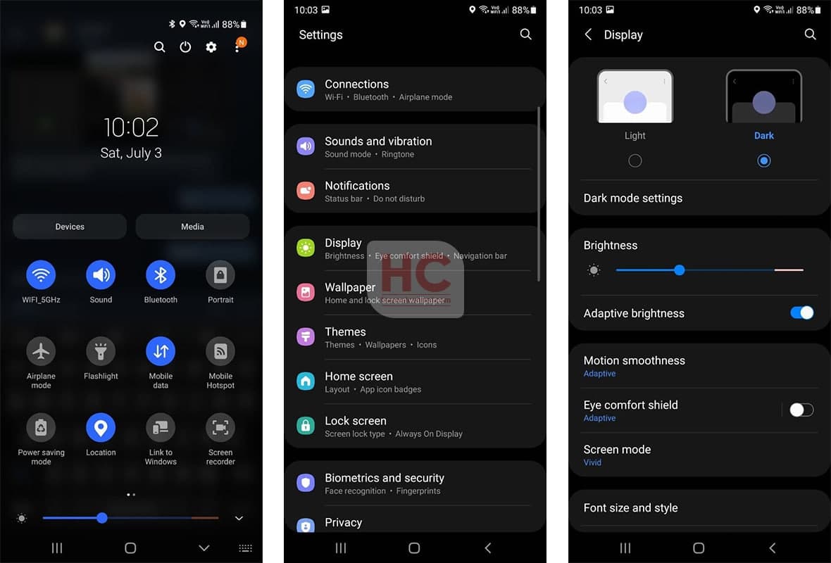
For the One UI 3.1 vs HarmonyOS 2 dark mode comparison, we’ll be jumping on the following element and system apps:
- Quick Settings
- Settings Menu – Menu icons and view
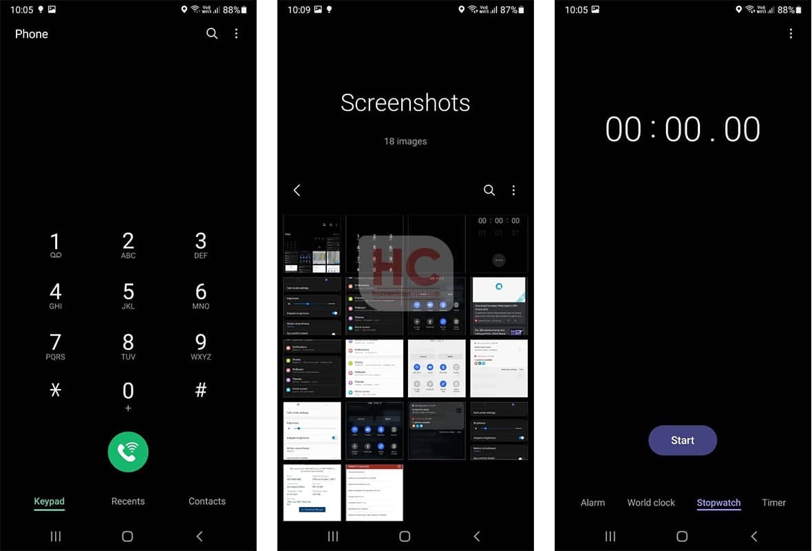
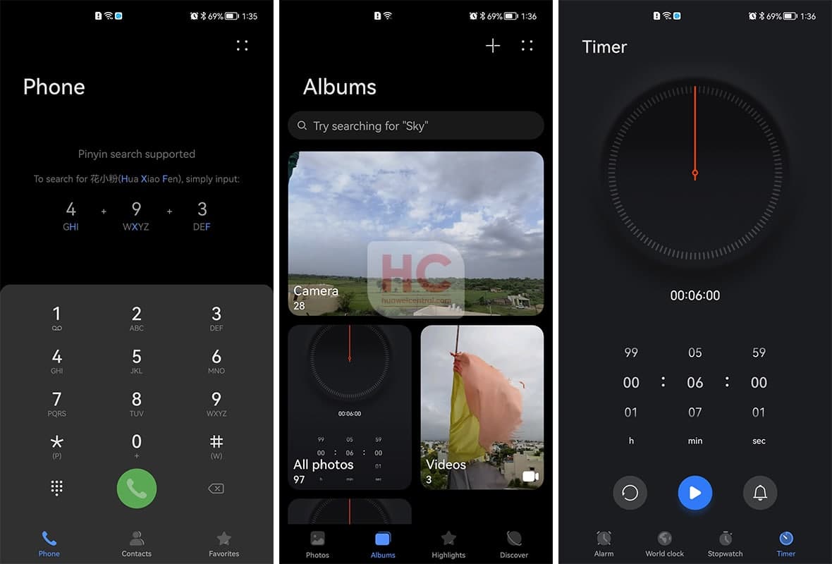
- Apps – Clock, Gallery, and Dial
Let’s begin
One UI 3.1:
In Dark Mode, One UI 3.1 shows you accurate black and blue color combination that is precise and easy to adapt by the users’ eyes. Once enabled, the quick access switches change their appearance from gray to blue, giving the instant feeling of touch feedback and a change in the color scheme.
Aside from that translucent background, the text and the icons in the UI is a bit brighter, when you increase the brightness or becomes so invisible if you keep the brightness at the lowest possible.
HarmonyOS 2:
HarmonyOS 2 has the perfect combination of blue and gray in the control panel and Huawei has made the Setting colors so much comfortable to see and interact with. These include a two-way user interface with a light gray section background and light-colored menu option icons.
The colors used in the user interface create a perfect mixture in the appearances of HarmonyOS 2 Dark Mode and puts it above One UI 3.1.

Also, Check: