
HarmonyOS
HarmonyOS UI/UX: Here is the information about new user interface from Huawei
After the official launch of HarmonyOS 2, this new operating system has become a league of topics among consumers. Also, the brand new HarmonyOS 2.0 started making its way for smartphones in the Chinese market.
However, some Huawei device users have installed the HarmonyOS 2.0 public beta version and begun enjoying new OS features.
As recently, HarmonyOS UX developer, Mr. Dafu has been spotted in the largest flagship store of Huawei in China. He made a special appearance to explain some of the changes and improvements that have been made in the user experience of HarmonyOS.
He stated that the HarmonyOS logo comes with a big “O” and underline dash. However, different peoples have different thoughts of this new logo. Among them, some said O represents the sun and dash shows horizon and more.
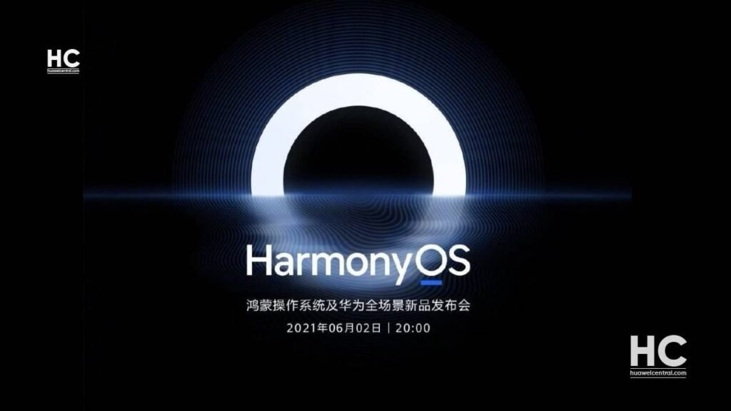
However, Mr. Dafu said the concept of HarmonyOS is very simple and can be defined under “HarmonyOS as One”.
“ONE stands for harmony and unity. A design language is used to get through multiple platforms and devices. This is a language of harmony and symbiosis.
The universe is a concept that derives everything. After connecting multiple devices, it creates more interactions and brings more possibilities through creativity,” says Dafu
![]()
According to the official, Huawei has made major changes in the color philosophy of HarmonyOS as it now includes the new starry sky grey replacing the pure black background. This new color also reflects the universe as well as its vastness, which expands as you dive deeper.
Once mixed with white snowy white, the user interface can present deliver primary color in three variants. Meanwhile, the auxiliary colors have high and low saturation that confirms visual consistency and improves view correction.
To provide a more death sense of visual space, all of the widget materials have been divided into one layer. The shadows of the widget element placed into a separate, while the depth of field in the background is placed in another layer.
In order to make a two-dimensional world, the visual sense of space between teh front, middle, and back are made possible with the help of distinctive materials.
Not to forget, HarmonyOS comes with a brand new font system – HarmonyOS Sans. The developer explains that this new font type represents “the birth after chaos but it’s actually not chaotic, which is a natural beauty of the universe.”
Thereafter, Huawei has categorized this font under three aspects including:
- Easy to read
- Unique
- Universal
The company gathered all of the details such as strokes and conjoined ones, which showcases the mixture of technology and human lives.
![]()
By concluding his explanation, the developer said that there are still many designs and things of HarmonyOS that could be discussed in the flagship store area of Huawei.
Also, check:
Here’s the meaning of HarmonyOS logo, boot animation, the big O and blue horizontal line