Comparison
EMUI 11 vs EMUI 12: Settings menu and its design

EMUI 11 has been a good software but the company has brought a set of new features with the successor – EMUI 12. These functions are new and better than ever before. Therefore, It’s time that we look into the Settings menu of EMUI 11 and EMUI 12.
EMUI 11:
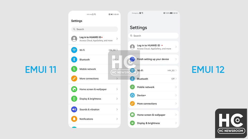
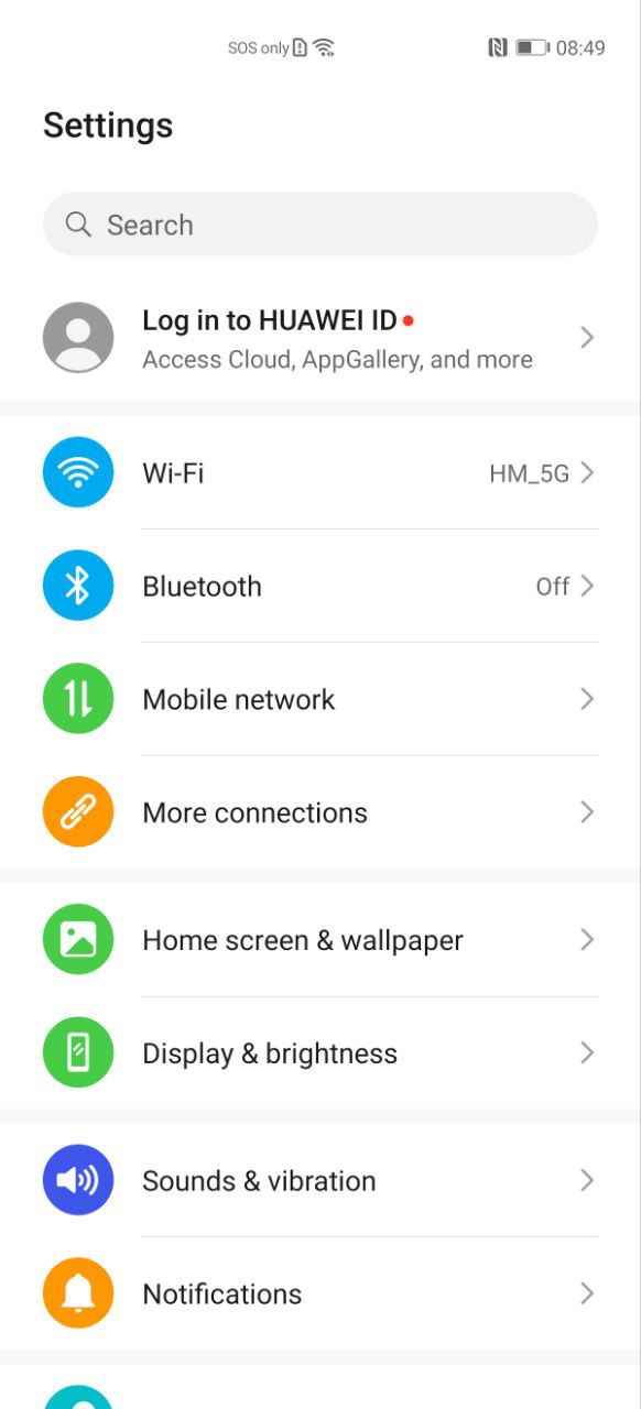
EMUI 11 comes with a straightforward design that has been adopted from EMUI 10.1 and EMUI 10.0. However, it has better fluency than the past versions.
The icons look good and are composed of vibrant colors. The background cards are straight and have sharp corners. The overall design is niche and elegant.

EMUI 12:
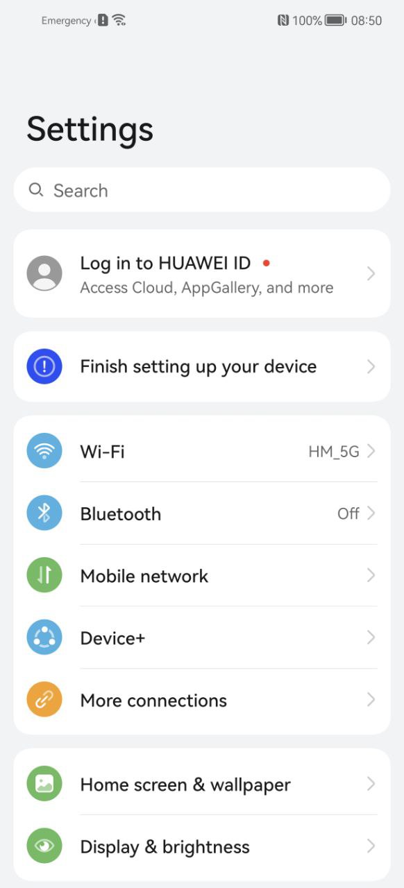
EMUI 12 Settings Menu has better visibility over EMUI 11 with the new font family. It has fresh designed fonts that help you to understand the labels clearly.
As compared to EMUI 11, the new Settings menu is inspired by the HarmonyOS operating system. You can check the difference between both of the settings menus as they are shown below.
The menu option icons are smaller than EMUI 11 and the color vibrance is subtle. On the other hand, the menu has a round corner background card to group certain categories of options.
In the end, the combination of icons, font, and the overall color increases the user experience and allows you to enhance interactiveness with eh user interface.


