HarmonyOS
iOS 17 vs HarmonyOS 4: Battery Indicator Icon Comparison

Huawei brought a new battery indicator with the HarmonyOS 4 operating system, there are new changes in this section and it’s time that we compare it with the main competitor – iOS 17.
Let’s take a look at the difference between these two in terms of the following:
- Size
- Color
- Visibility
iOS 17:
iOS has the most wide and tall battery indicator in all smartphones including Android devices. The battery indicator without percentage text has an outline and a white battery level area, which changes dynamically.
Once the battery percentage is enabled, the icon removes the outline and expands the fill into a battery shape with transparent number text engraved in the center. On the home screen wallpaper, the indicator has a white color scheme. The settings menu adapts a black color scheme. 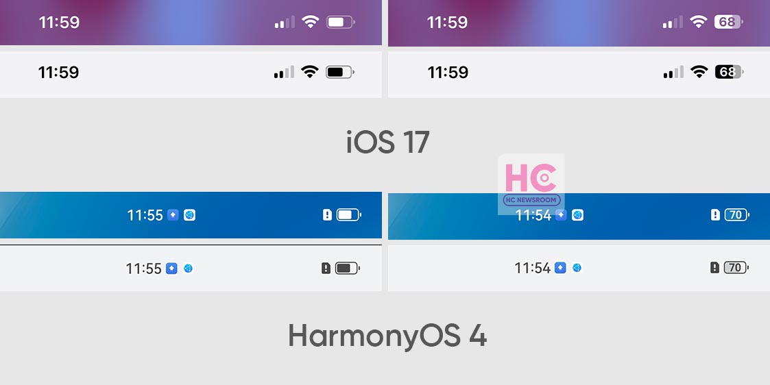

HarmonyOS 4:
As we explored, HarmonyOS 4 brings a new battery indicator identical to iOS but you may find it more precise than its competitor.
Talking about the shape, the HarmonyOS 4 battery indicator is slightly small but it has an increased border visibility. The color schemes are white and dark. HarmonyOS 4 carries borders with or without a battery percentage option. In comparison to iOS 17, HarmonyOS 4 brings perfect constraints on all sides of the icon.
Conclusion:
The changes in the battery indicator icon take HarmonyOS 4 close to iOS 17 and the competition between these two is shrinking to the lowest. The size factor gives iOS 17 more visibility while HarmonyOS 4 picks the win for subtleness.