Comparison
iOS 14 vs HarmonyOS 2: Comparison of Settings user interface
We recently conducted a comparison between HarmonyOS 2 and Oxygen OS 11 in terms of the Settings menu user interface as well as design parameters. Today, we’ll compare iOS 14 and HarmonyOS 2 for the same feature.
iOS 15 is also under development and Apple is also looking to introduce this new software on iPhones. Since the software is still under beta testing, we look back to iOS 14, and is perfect for our comparison.
So, without further ado. Let’s begin our iOS 14 vs HarmonyOS 2 Settings menu comparison.
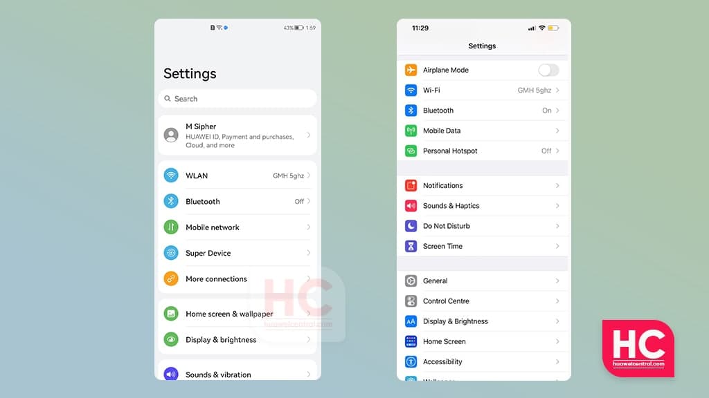
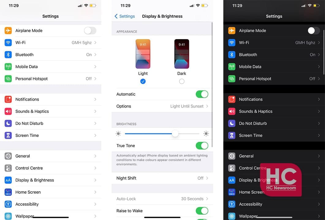
iOS 14:
iOS 14 Settings menu carries the same design changes as previous iOS devices, the UI looks clean and tidy.
The icons are colorful and remain vibrant even in the dark mode feature. Also, the description of some options is very informative and helps users to learn more about the corresponding feature.
The operation around the UI is very simple and enables the gentle transition from one screen to another to provide a good user experience.
HarmonyOS:
Huawei HarmonyOS 2 settings menu has its own uniqueness, the round corner background container enhances the look of a particular set of settings elements.
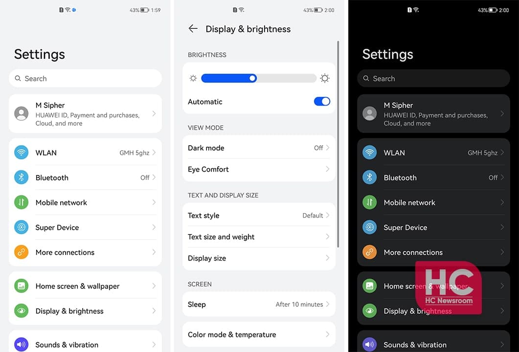
The HarmonyOS fonts appear elegant alongside the well-baked icons on the same row. The animation and transition are quick and smoother than the iOS.
Furthermore, the dark mode feature in HarmonyOS provides a better user experience and low contrast compared to iOS 14. Therefore, the overall Settings menu and the layout are provided better in this new operating system.
Also, Check:
HarmonyOS 2.0 vs EMUI 11: Settings UI, Fonts, Icons, Sections and more