Comparison
Huawei HarmonyOS 2.0 vs Samsung One UI 4.0: Quick Settings Panel
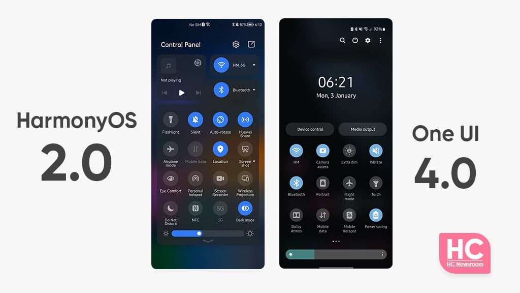
HarmonyOS 2.0 comes with a bunch of new features including the new Control Panel that replaces the old unified quick settings panel. On the other hand, you have the Samsung One UI 4.0 and we’ll be going to compare it with HarmonyOS 2.0 for the quick settings panel in this comparison.
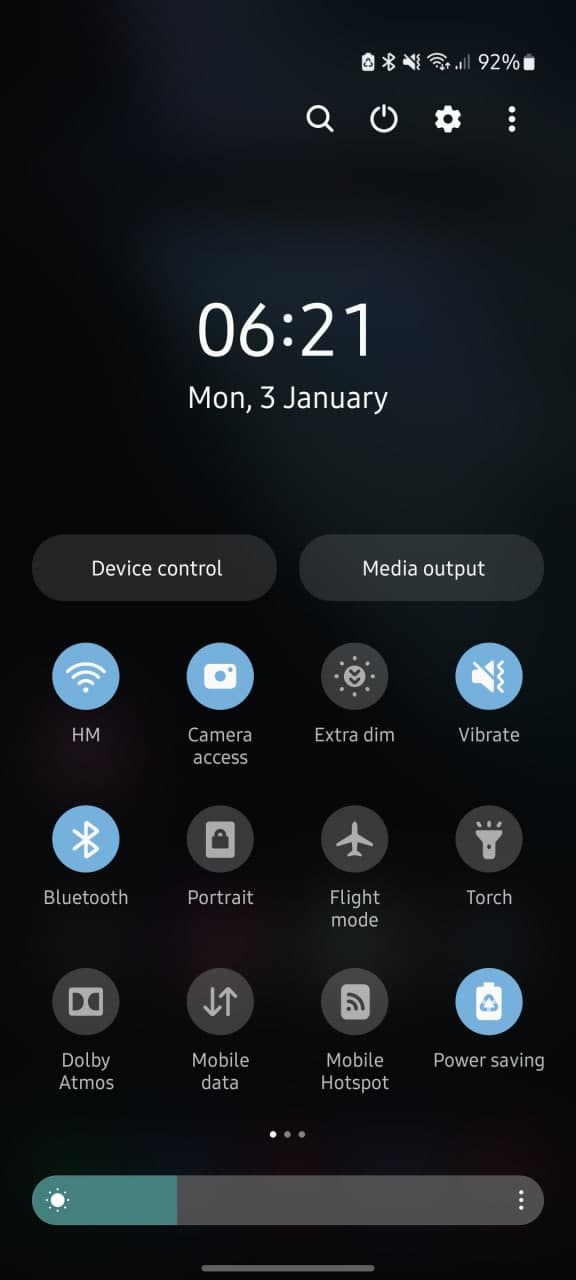
Let’s talk a little bit about the One UI 4.0 first, Samsung’s latest software is based on Android 12 and brings a bunch of new enhancements over its predecessor. Therefore, its UI has been revamped and supported by some extra customizations thanks to the latest Android version. However, one thing to note is that One UI 4.0 still has the unified quick settings and notification panel.
Now, let’s begin our comparison of HarmonyOS 2.0 vs One UI 4.0 quick settings panel.
One UI 4.0:
The Quick settings panel of One UI 4.0 enhances the user experience over One UI 3.1. For instance, the quick switch icons now have a more subtle appearance and thanks to the Android 12 operating system, Samsung phones can customize the color of the entire user interface, including icons, based on the home screen wallpaper.
Another thing to mention is that the system font is also polished and increases the visibility for areas such as time and date. Talking about the minor changes, the One UI 4.0 has minor tweaks in the slider area, which has become a bit cozy to access. There are also, two large buttons for Device control and media output management.
HarmonyOS:
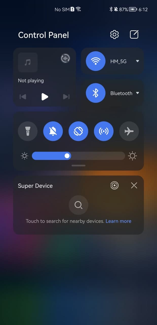
HarmonyOS 2.0 has its own vibe that will clearly reflect on its quick settings called Control Panel, you just need to swipe down from the right corner and bring it on. In comparison to One UI 4.0, HarmonyOS has separated the notification center and control panel for easy access to the different features in various interaction-friendly aspects.
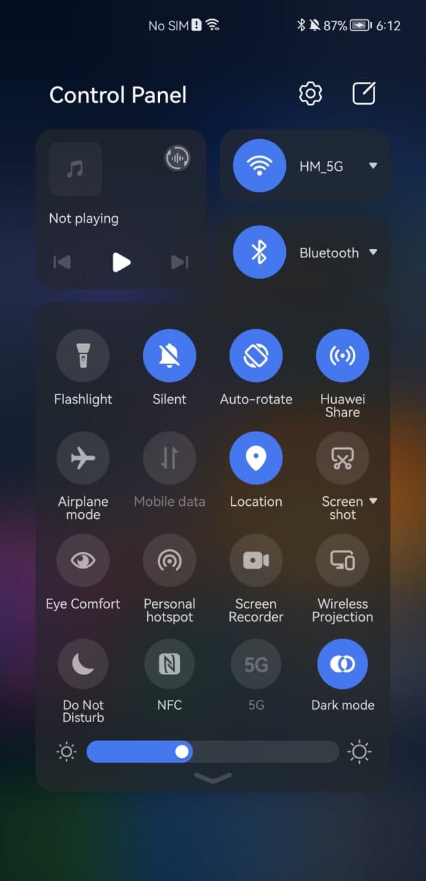
The HarmonyOS sans font looks good on the user interface and system icons for Settings and layout editor are also there. The use of media and connectivity switches brings ease of access for specific features such as music, WiFi connections, and Bluetooth. On the other side, the quick access switches are brighter and come with a perfect size that won’t miss a tap from your finger.
In addition, to Settings, you’ll also see Super Device manager and smart connected device controller widgets below the quick settings.
Conclusion:
Both of these user interfaces are really good but HarmonyOS 2.0 has the upper hand in some areas of navigation and control over the quick settings. Still, One UI 4.0’s new color palette and virtual power on the switch are really big features that HarmonyOS 2.0 missed.